Scanlife Mobile Engagement Platform is SaaS web app with five million users and it can help digital marketers generate, manage, and measure intelligent barcode campaigns. The app provides users advanced feature such as dashboard, data analysis with mobile triggers from QR codes, Microsoft Tag to NFC formats. I've published my design process for redesigning SaaS web app on Medium.com, Take a look.
My Role: From July 2013 - May2014, starting as UX/UI intern, I reported directly to VP Product and collaborated with front-end engineers to design Scanlife SaaS web application and also redesigned its pricing page and its mobile apps.
Identify Problems
“Why we want to redesign this?” “Which features do you wish to optimize?” and “Which user actions would you like to encourage most?” etc. Asking questions and collecting input from stakeholders helped me to understand the business goals and what’s the real problem I need to solve.
The Bad User Experience.
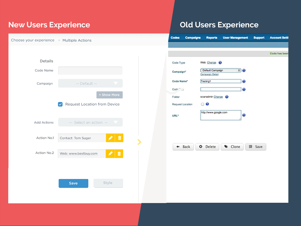
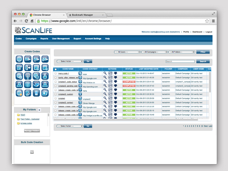
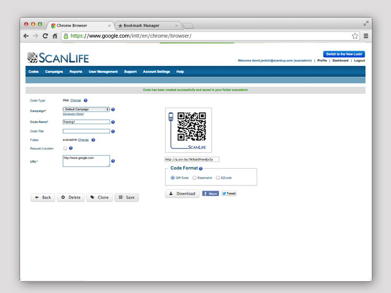
After defining the goal, encouraging more users to create QR codes, we immediately find out the old user experience of home page was very misleading. Users were unlikely to know where to start creating QR code. On the other hand, the web app didn’t have the navigation to info users where they stand and what’s the next step. When users wanted to create a code, it took to many steps to complete this task. Each steps was not clear and organized. Below are the old home page and creating codes page.
Persuade Stakeholders and Solve Conflicts
This application was a tool mainly for the marketers (targeted users). Thus, the functionality had the most priority. However, there was a conflict about which feature had the most priority, “Create a code” or “Manage codes”. The team couldn’t make a decision about which feature should be presented to the users in the first place. To solve that conflict, I built two-user journey based on analyzing the type of users and scenarios. As a result, I differentiated the experience for new users and power users. For the new users, their prioritized task was to create a code. In this case, they will see the “create a code” feature after login to the app. For the power users, they will see the “manage codes” features after login to the app.


Simplified User Flow
After choosing a model for the most common visitor, the typical user path was much clearer. By reducing the steps necessary to create a code action, the experience was simplified. To reduce and simplify the steps of creating a code as much as possible, a pop-up box was designed to connect the actions of create, download, and style a code.
Extract Content- Object-Oriented UX
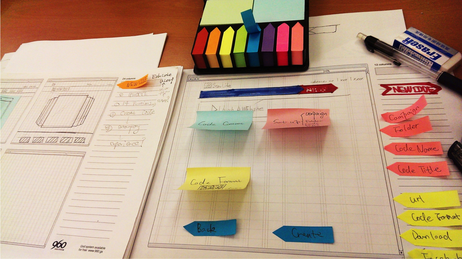
A Unique Way to Solve Problems
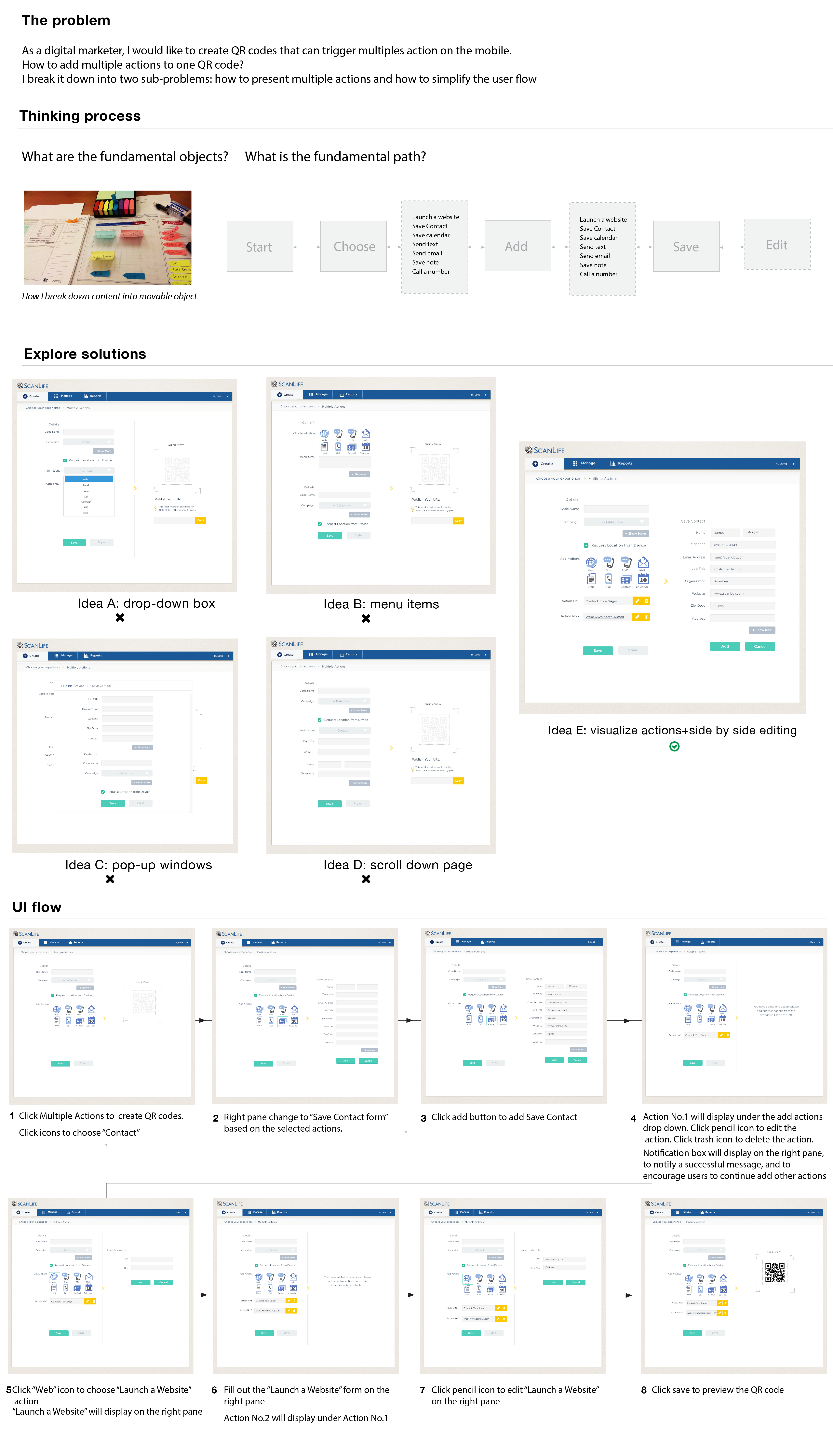
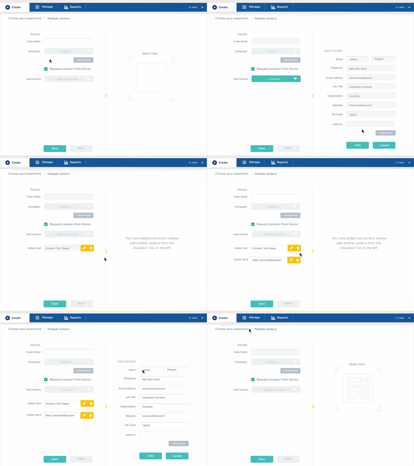
Prototypes
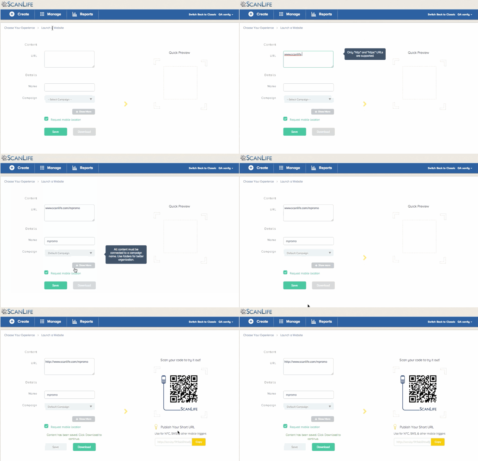
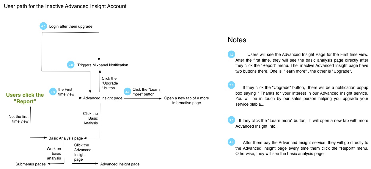
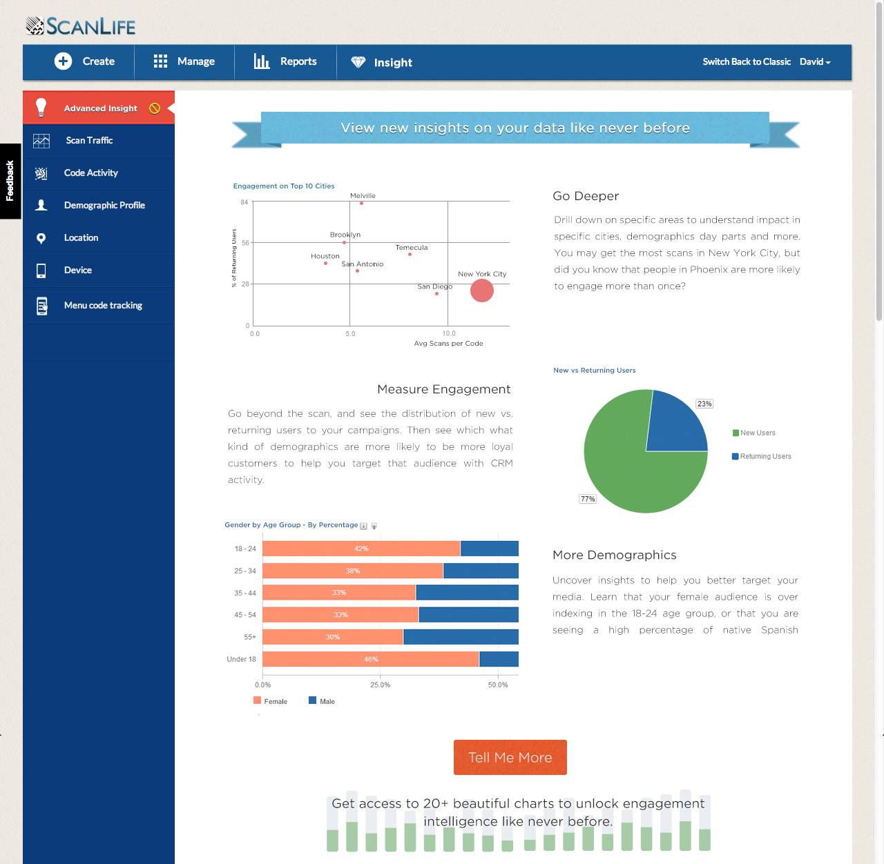
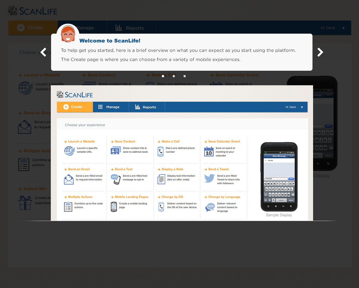
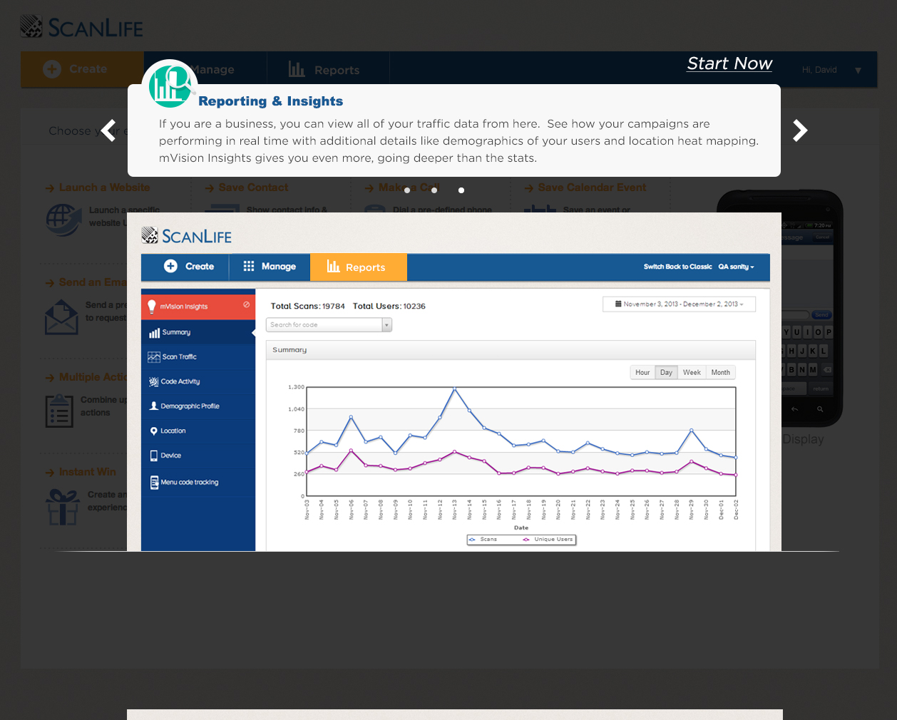
Design onboarding experience for new features
Achievement
Pricing Page Redesign
I redesign the pricing page. It is alive!Click here!

Mobile App-Onboarding Experience Design
